An honest look at a distraction free Bible
Item Reviewed: NKJV, Deluxe Reader’s Bible, Leathersoft, Black, Comfort Print by Thomas Nelson
LCCN: 2017944803
ISBN: 9780785216100

Reading the Bible can have many different purposes such as studying a particular topic, or memorizing scripture, or seeking to understand a story and how it relates to another part of scripture. But sometimes we just want to read the words without distraction, to be absorbed by the narrative and to really hear what God is saying. The NKJV Deluxe Reader’s Bible is perfect for just that.
In this brief review, I’ll cover the main points of what a Bible usually contains and how that applies to this unique format of Bible. I’ll showcase how books, chapters, verse and sections are noted. I’ll also go over the binding and materials.


Inside the pages of this Bible you won’t find verse markings every sentence or two. Can you imagine reading a novel with divisions like that? It would be very distracting and disruptive. You also won’t find references and cross references at all. Instead, you’ll see the following main things.
Main Features
Features Included
For any Bible, a good balance between readability and passage location is very important. The designers of NKJV Deluxe Reader’s Bible have done a very good job finding this balance. In the following points, I’ll go over what sets this Bible apart from more traditional layouts.
Table of Contents
The table of contents is very basic. It shows the title of each book of the Bible and the corresponding page that it begins on. The opposite page has the standard publishing information such as copyright, etc.

Book Titles
The title page for each book in the Bible are large, all-caps, bold, and in red. They occupy the entire page with only the page number and a quote from a well-known speaker or author directly below.
I personally ignore the quotes inserted here and feel that they are unnecessary and antithetical to the purpose of a reader’s Bible.

Sectional Headings
The sectional headings are minimal but sufficient. Since this is the NKJV text, the headings are part of it. However, there is nothing additional such as introductions to further interrupt the flow of the narrative. The sectional headings are set in bold, red text. (i.e. “The Reign of Solomon” which is the beginning heading for 2 Chronicles chapter 1)

Chapter Numbers
Chapter numbers are set in red type on the margin of the text. They do not disrupt or distract from the flow of the copy at all and are always on the outside edge of the page.
I really appreciate how the chapter numbers have been handled. They are easily discovered when needed, but not distracting.

Verse numbers
Verse numbering is probably the only part of this Bible that is partially omitted since there aren’t verse number indicators for each verse. Instead, numbering begins on verse five and is marked again on every fifth verses thereafter. So only verses five, ten, fifteen, etc. are numbered. The text is superscript, in the gutter, and black.

Page Numbering
Pages are numbered at the bottom and in red type, but the only reference to them is in the table of contents.


Poetry
In the NKJV Deluxe Reader’s Bible, Poetry is formatted like poetry should be. It has line breaks by poetic line rather than allowing the text running the full width of the page.
I really like reading songs and poetry in this Bible because it is laid out as such, but doesn’t have any distractions. Other Bible also use this layout style but add in references and clarifications that often trip up a reader from truly understanding the passage.


Two marking ribbons, both red.
The ribbons are about one quarter of the way into the front, and again one quarter of the way from the back. Essentially, one ribbon for the first half and one ribbon for the second half of the Bible. They have enough length to reach to any Book and still stick out the bottom enough to be used as an opener. The ribbon seems to be mid-grade quality ribbon – not terrible, but definitely not high quality.


Typeface
The typeface is custom designed for the NKJV. I find it very nice to read.
Because there is no book in the world more important than God’s Word, we commissioned a custom typeface designed specifically for the NKJV Bible. With the NKJV Comfort Print typeface, each letter has been carefully crafted to make reading a pleasure.
– Thomas Nelson Publishers

Physical Characteristics and Quality
While the layout choices are very important, the materials and construction of the Bible are equally so. A good reader’s Bible visual experience can be ruined by a bad physical presentation. I’ll discuss the pros and cons of the NKJV Deluxe Reader’s Bible’s physical characteristics below.
I don’t have any trouble turning pages. Sometimes Bible paper is so thin and delicate that it can be hard to separate two pages without crinkling or tearing them. This paper doesn’t cause that trouble for me.
Dimensions & Weight
This is a reasonably sized Bible, but at 2.87 pounds it isn’t super lightweight. Long reading sessions might have you reaching for something to rest the Bible on to assist in holding it up. That said, it isn’t unbearably heavy. I’ve often rest books on my lap or on pillows anyway, so this Bible has not been an inconvenience due to weight.
The size is very nice and just right, in my opinion. At 9.5 inches tall, 6 inches wide and 2 inches thick, this is comfortable to hold.
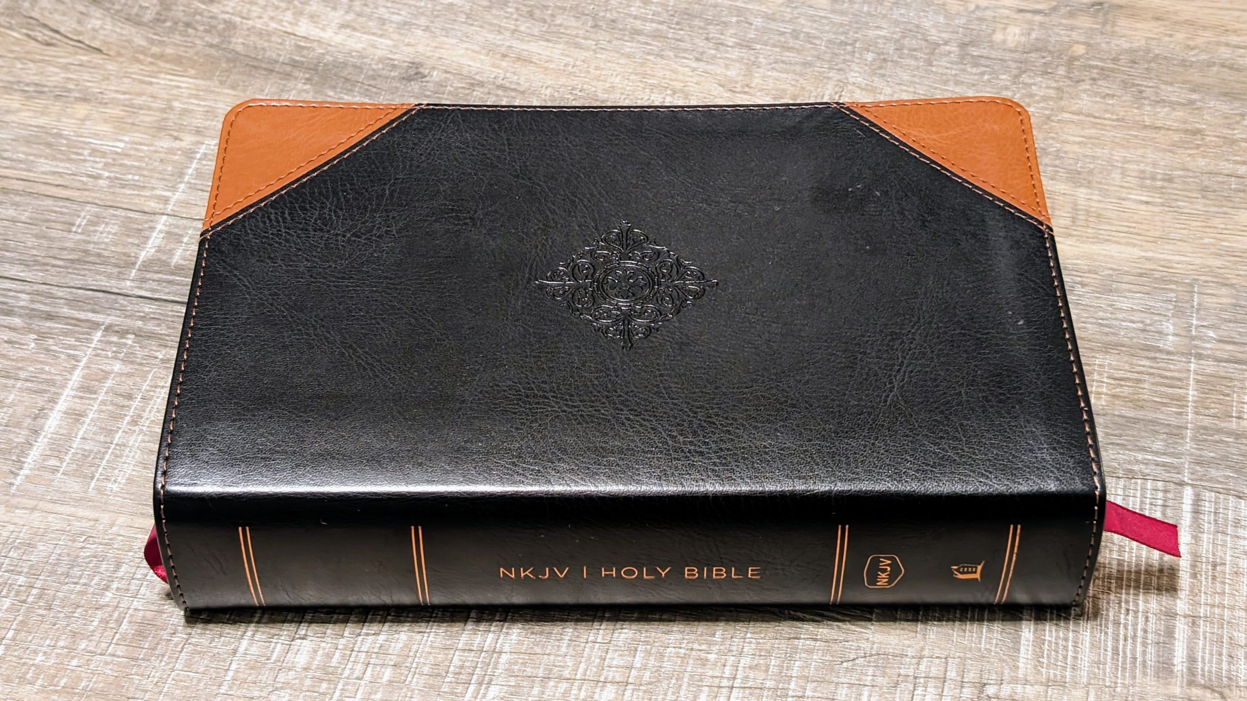
Cover Materials
The cover is made of duotone Leathersoft. It’s fake leather but looks and feels like it is real. While this particular cover is not super flexible, it is flexible enough that the Bible can easily remain open. Which leads me to the binding…
Binding & Lay Flat
The binding has been very nice to use and has held up well so far. I purchased this in 2018, so I’ve been using it just over five years. The binding shows no signs of wear or degradation.
This Bible is meant to be held and read, rather than laid on a table and studied from. To that end, it doesn’t lay open perfectly well but will stay open once you are at about page 100 or have 100 pages (50 sheets of paper) left at the end. The entire book is 1,940 pages so this really does stay open fairly well.
Paper Quality
Paper quality is the one area that is left wanting. The pages feel fine and have that soft ‘Bible paper’ feel to them. However, the pages are thin enough that the text on the reverse side always shows through. I do wish this one item could have been addressed differently as I do find the text from the other side a little ‘messy’ and distracting. The gilding is great and hasn’t rubbed off yet. The edges still look very nice.
Features Not Included
As this is not the typical Bible layout, there are also some standard Bible features that are notably absent. The following do not appear in this Bible:
- Words of Christ in Red – this is actually disappointing to me as I do not find this feature to be distracting when it is included.
- Historical or cultural explanations to clarify context.
- Index
- Maps
- Concordance
Personal Experience
During the five years that I have owned this Bible, I’ve used it only for reading when I want to be absorbed into the text and not get distracted with explorations and comparisons.
I noted above that I think the size is just right, but at the same time it could have been done differently and still be right. This is because at times I do find that it could have been just a tad wider so that the pages would stay open more easily. I would have appreciated if the weight could have been reduced somehow.
While reading I truly do forget all about the chapters and verses. Only the section headings provide any sort of distraction, and I would argue that they help clarify what is happening in the text.
There is a slipcase that this comes with, but I’ve never used it. It is a simple fabric covered board of some kind and seems good quality, but I don’t think it matches the Leathersoft and I don’t really need it.
The ribbons are really useful to me, even more than in a Bible I would use for studying. I like to read in this Bible for the story, so leaving the ribbon there to come back to later really helps. And since there are two ribbons, I can read in two places at different times and easily keep track of where I’m at.
I have one other reader’s Bible (MSG) and another single-column reference Bible (ESV). Comparing all three I can say that the two I have which are designed solely for reading through the text truly do keep you focused on the words. Even the simple addition of verse numbers can be distracting.
I like this format so much that I wish there were many more published.
Conclusion
The NKJV Deluxe Reader’s Bible is a super nice and budget friendly Bible, especially for anyone who just wants the text and nothing more. There a couple of areas that could have been done better but overall it is nicely made and an attractive, simple presentation of the Word of God.
Get your own copy here: Amazon

Share your thoughts